Treasury loves data, and for good reason. High-quality data can improve cash visibility, strengthen risk management, support better decision-making, reduce surprises, and give treasury a stronger voice within the business.
But having more data does not automatically mean having more insight.
Some data creates clarity; some simply creates noise. Some dashboards genuinely help treasury teams understand risk and make decisions, while others provide a comforting impression of control without changing what the organisation actually knows or does.
That distinction matters, because even the most beautiful treasury dashboard can still be dangerously useless.
The Rise of Data Theatre in Treasury
Many treasury teams have invested heavily in reporting, dashboards and analytics. Cash positions are visualised in real time, forecasts are tracked, FX exposures are displayed, and working capital metrics can be analysed by entity, currency, region or business unit.
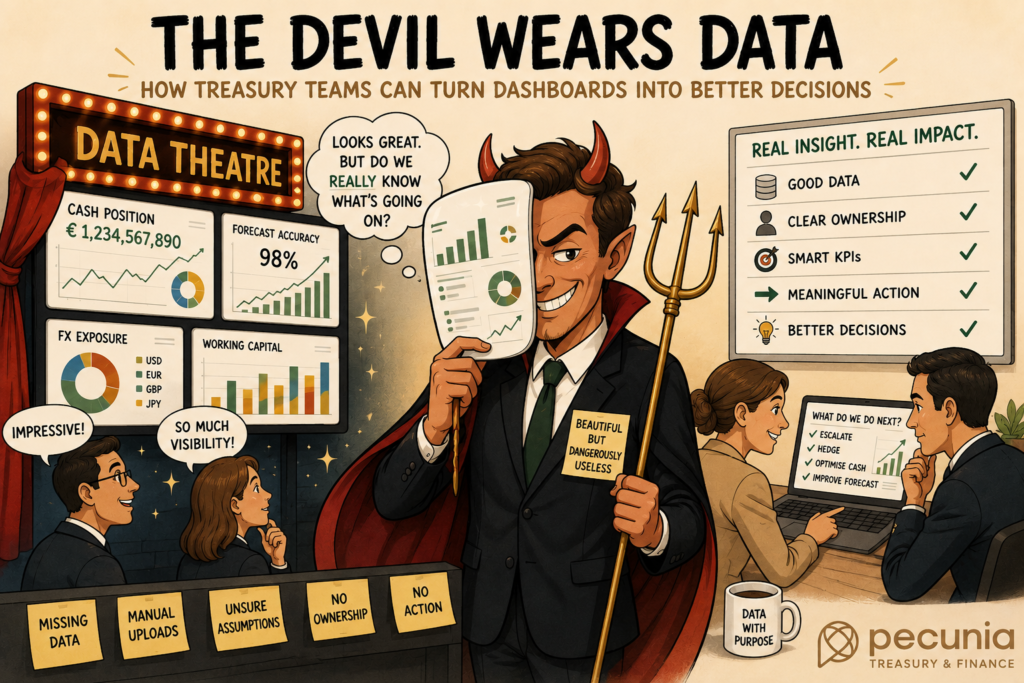
All of this can be extremely useful. The problem begins when reporting becomes a form of data theatre: reporting that creates the impression of insight without genuinely improving decision-making.
It might be a dashboard packed with charts but offering little guidance on what to do next, or a KPI pack that gets circulated every month without anyone challenging the numbers. It could be a cash forecast accuracy report that looks scientific but never investigates why the forecast is wrong, or a liquidity dashboard that displays balances across the organisation without explaining how much of that cash is actually available.
The same problem appears when an FX exposure report is beautifully formatted but relies on incomplete business input, or when a polished board report creates confidence because of how professional it looks rather than how well the underlying numbers are understood.
Data theatre is particularly dangerous because it feels like progress. It gives treasury something tangible to present to management, but showing more is not the same as knowing more.
A Treasury Dashboard Is Not the Same as Control
One of the biggest traps in treasury reporting is confusing visibility with control.
A dashboard can identify a problem, but it cannot automatically solve it. Seeing trapped cash does not mean treasury can access it. Identifying forecast variance does not mean the team understands what caused it. Displaying bank balances does not prove that the banking structure is efficient, just as visualising FX exposure does not mean that the underlying risk is being managed appropriately.
The same applies to covenant monitoring. Seeing a covenant ratio on a screen is useful, but it does not necessarily mean the business understands what could move that ratio or how quickly the situation could change.
Visibility is essential, but it is only the beginning. Real treasury control requires interpretation, ownership, escalation and action.
Without those elements, treasury has not created control. It has created a very pretty warning light.
Why the Wrong Treasury KPIs Can Be Misleading
Treasury KPIs are valuable only when they support better decisions. Yet KPIs are often selected because they are easy to measure, familiar to management or convenient to automate rather than because they genuinely reflect the risks treasury needs to manage.
Cash flow forecast accuracy is a good example. It is one of the most common treasury KPIs and, used correctly, can provide valuable insight. However, a forecast may appear accurate at group level while hiding significant errors at entity level. A strong percentage score can conceal large absolute variances, while overstatements and understatements may cancel each other out and create an apparently impressive result.
The KPI looks healthy while the underlying forecasting process remains unreliable.
Liquidity metrics can create similar problems. A dashboard may display total cash without distinguishing it from available cash. It might show liquidity headroom without highlighting restrictions, or aggregate bank balances without accounting for trapped cash, tax constraints, regulatory requirements or operational limitations.
The headline number looks clean. The reality underneath it is considerably messier.
And in treasury, the messy part is usually where the risk lives.
Pretty Reporting Can Hide Poor Data and Assumptions
The more sophisticated a dashboard looks, the easier it can become to trust it. That trust is not always deserved.
Treasury reports are only as reliable as the data, assumptions and processes underneath them. Before relying on a report, treasury should understand where its data comes from, how complete it is, how frequently it is updated and who owns the inputs.
Teams should also know what has been excluded, which assumptions remain manual, where calculations have been hardcoded, how exceptions are handled and at what points human judgment enters the process.
If treasury cannot answer these questions, a report should not automatically be considered reliable simply because it uses modern colours and comes with an impressive filter menu.
A dashboard does not become intelligent because it has interactive buttons. It becomes useful when the data, assumptions, controls and ownership behind it are sound.
Five Questions Treasury Leaders Should Ask About Their Data
Before trusting an attractive treasury report, leaders should ask a few uncomfortable questions. Not because anyone wants to make treasury meetings longer- humanity has already suffered enough… but because these questions help separate useful reporting from decorative analytics.
1. What decision does this report support?
Every treasury report should have a clear purpose. “Management wants to see it” is not, by itself, a sufficient reason to produce one.
A useful report should help answer a specific question: Do we have sufficient liquidity? Are we exposed to unacceptable FX risk? Is our cash forecast reliable enough to support funding decisions? Are working capital movements creating pressure? Are our banking costs justified? Are key treasury controls operating effectively?
If a report does not support a decision, it is worth asking whether treasury needs it at all.
2. Is the KPI measuring what actually matters?
KPIs can easily become disconnected from the business problem they were originally intended to measure. Treasury teams therefore need to distinguish between what is easy to measure and what is actually useful.
Do we care about total cash, or available cash? Forecast accuracy, or forecast usefulness? The number of bank accounts, or the operational complexity those accounts create? Hedge ratio, or actual risk reduction? Payment speed, or payment control?
A good treasury KPI should reflect the underlying business problem, rather than simply the data point that happens to be available.
3. What is missing from the data?
This may be one of the most important questions treasury can ask because every dashboard excludes something. The danger begins when nobody knows what that something is.
Missing entities, manual uploads, delayed bank statements, unmapped accounts, offline spreadsheets, business units outside the reporting process, local restrictions, unrecorded exposures, pending payments and incomplete intercompany data can all distort the picture.
Treasury leaders should understand these gaps because incomplete data can create false confidence. A report that is only 80% complete can still look 100% professional.
That is exactly the problem.
4. Who owns the data and the outcome?
Treasury data often passes through multiple hands. Finance owns part of it, treasury another part, IT manages the systems, local teams upload files, banks provide statements, and business units submit forecasts.
Then everyone acts surprised when the number is wrong.
Effective treasury reporting requires clear ownership. Who provides the data? Who validates it? Who investigates exceptions? Who acts on the result? Most importantly, who is accountable when the information is incorrect?
Without clear ownership, dashboards quickly become everyone’s responsibility, which is often where accountability goes to retire.
5. What action follows from this insight?
Good treasury reporting should lead somewhere.
It might prompt the team to escalate a risk, execute a hedge, arrange funding, invest excess cash, challenge a forecast, clean up data, change a process, update a policy or adjust a limit.
If a report consistently produces no action, it may not be insight at all. It may simply be wallpaper.
Treasury reporting should therefore go beyond answering “What happened?” It should help decision-makers understand “So what?” and, most importantly, “What do we do next?”
Why Data Quality Is a Treasury Responsibility
Data quality is often treated primarily as an IT problem. That is convenient, but incomplete.
IT teams can support integrations, systems and data architecture. Treasury, however, must define what good data actually means within the context of treasury management.
Which cash is genuinely available? Which exposures are relevant? What forecast horizon matters for decision-making? Which entities should be included? Which currencies require attention? What constitutes a material variance? Which controls need to be applied?
These are treasury questions.
Technology can process the information, but treasury professionals still need to understand what that information means.
AI in Treasury Makes Data Quality Even More Important
Artificial intelligence is creating significant opportunities for treasury reporting and analytics. AI can help identify patterns, explain variances, detect anomalies, improve cash flow forecasting, process documents and support faster decision-making. Check out our article on Automation HERE
However, AI does not remove the need for good data. If anything, it makes good data even more important.
When the underlying information is incomplete, inconsistent or poorly defined, AI cannot magically repair the foundation. Instead, it may simply produce confident nonsense faster than a human could manage manually; which, admittedly, is efficiency in the worst possible way.
Treasury leaders should therefore view AI as an accelerator rather than a substitute for judgment. The stronger the underlying data foundation, the more useful AI-powered treasury analytics can become. The weaker that foundation is, the greater the risk that sophisticated technology simply makes poor information look more convincing.
From Treasury Reporting to Real Insight
Treasury does not need more dashboards simply for the sake of having dashboards. It needs better questions, better data and better decisions.
The best treasury reporting is not necessarily the most visually impressive. It is the reporting that helps teams understand risk, identify problems earlier, act faster and advise the wider business with confidence.
That requires fewer vanity KPIs and less decorative analytics, alongside greater attention to decision-making, assumptions, ownership and, critically, what the data does not show.
Because the real danger is not having too little data.
It is having enough data to feel comfortable, but not enough insight to be right.
How Pecunia Helps Treasury Turn Data into Decisions
At Pecunia Treasury & Finance, we see this challenge regularly. Treasury teams rarely struggle because they simply lack dashboards. More often, the challenge is that data, processes, ownership, and decision-making are not properly connected.
This is where experienced treasury professionals, data experts and AI specialists can make a real difference. The objective should not be to build prettier reports, but to help treasury teams ask better questions, strengthen the underlying data, design meaningful KPIs and turn reporting into practical insight.
The future of treasury will not belong to the teams with the most data. It will belong to those who know which data matters, what it means and what to do with it.