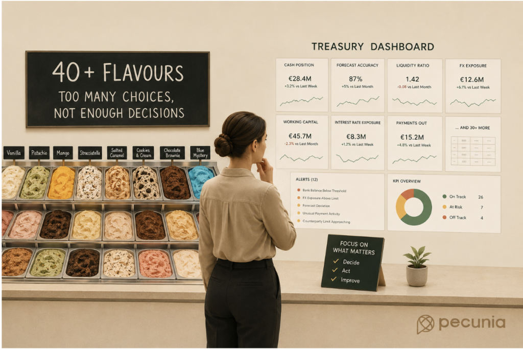
Vanilla. Pistachio. Mango. Stracciatella. Salted caramel. Cookies and cream. Chocolate brownie. Something bright blue that nobody can quite identify.
You walked into the ice cream shop wanting one scoop. Five minutes later, you are staring at 40 flavours and reconsidering every decision that brought you here.
At some point, more choice stops being helpful. Treasury data can work surprisingly similarly.
Modern treasury teams have access to more information than ever before: cash positions, forecasts, FX exposures, liquidity ratios, working capital metrics, bank balances, payment data, interest-rate exposures and countless other indicators.
That is undoubtedly a good thing, until treasury has so much information that identifying what actually matters becomes difficult.
The challenge is no longer simply getting the data. Increasingly, it is deciding which data deserves attention. Because nobody needs 40 flavours when they already know they want pistachio, and treasury probably does not need 40 KPIs when only five of them influence a decision.
More Treasury Data Does Not Always Mean More Insight
For years, one of treasury’s biggest challenges was obtaining reliable information. Cash balances could be spread across multiple banks, entities and countries, forecasts lived in spreadsheets, and reports required significant manual work to produce.
Technology has changed that. Treasury management systems, automation and analytics can now bring enormous amounts of financial information together quickly, giving teams much greater visibility over cash, liquidity, exposures and forecasts.
But solving the information shortage has created a different challenge: information overload.
When everything can be measured, it becomes tempting to measure everything. And when everything is presented as important, it becomes much harder to see what actually requires attention.
Welcome to the Treasury KPI Menu
Imagine opening a dashboard containing 37 treasury KPIs. Several are green, three are amber and one is red. There are six charts, four trend lines and a number in the corner that somebody added two years ago and nobody remembers why.
Technically, there is a lot of information. Practically, what are you supposed to do with it?
Effective treasury KPIs should help teams understand performance, identify risk and make better decisions. They should answer meaningful questions: Is liquidity sufficient? Is forecast accuracy improving? Are significant exposures changing? Are working capital movements creating pressure? Is there an exception requiring intervention?
If a KPI does not help answer a useful question, its presence may be creating more noise than value.
The goal is not to display everything treasury can know. It is to highlight what treasury needs to know.
Not Every Treasury Metric Deserves a Scoop
Treasury reporting has a habit of accumulating. A new risk appears, so another metric is added. Management asks a question, so another report is created. A new system provides additional data, so another dashboard appears.
Information keeps being added, but rarely removed.
The problem is that attention is limited. Treasury professionals cannot investigate every movement, monitor every metric and react to every alert with equal urgency.
A good treasury dashboard therefore needs hierarchy. The most decision-relevant information should be immediately visible, while supporting detail remains available when needed.
Think of it like the ice cream counter. You might technically have 40 flavours available, but the board at the front only needs to show the favourites.
When Every Treasury Alert Is Urgent, None of Them Are
Information overload also happens through automated alerts. Systems can flag exceptions, threshold breaches, forecast movements and unusual activity much faster than before.
But if treasury receives too many alerts, people eventually stop treating them as alerts.
An email arrives, followed by another, then six automated notifications and a warning about something technically unusual but completely expected. Eventually, the human brain develops its own sophisticated automation system: ignore notification.
Alerts therefore need prioritisation too. A useful alert should indicate that something meaningful has happened and may require action, rather than simply confirming that the system noticed another number exists.
Start With the Decision, Not the Data
One way to reduce treasury data overload is to reverse the reporting process.
Instead of asking, “What information can we put on this dashboard?”, ask, “What decisions does treasury need to make?”
Then work backwards.
If treasury needs to decide whether additional funding may be required, which information supports that decision? If the team is managing FX risk, which exposures and thresholds matter? If management wants to understand future liquidity, which forecasting metrics provide the clearest picture?
This turns reporting from a collection exercise into a decision-making tool. Data earns its place because it supports a purpose, not simply because the system happens to have it available.
Different People Need Different Treasury Information
Another reason dashboards become overcrowded is that organisations try to make one report work for everyone.
But a treasury analyst, group treasurer, CFO and board member are unlikely to need the same level of detail. An analyst may need transaction-level information to investigate an exception, while a CFO may primarily need to understand major movements, risks and decisions requiring attention.
The underlying data can be the same, but the way it is presented should not be.
Otherwise, the CFO ends up looking at the financial equivalent of an ice cream menu containing the full ingredient list for every flavour: technically informative, but not particularly helpful when you just want to choose dessert.
Better Treasury Reporting Requires Saying No
There is a surprisingly difficult skill involved in improving treasury reporting: removing things.
Adding another KPI feels productive, while removing one can feel risky. What if somebody needs it later? What if someone notices it is gone?
But prioritisation inevitably means deciding that some information does not deserve equal prominence. That does not mean deleting the data. It may simply mean moving it into a secondary report, making it available on demand or reviewing it less frequently.
The objective is not to have less information available. It is to have less irrelevant information competing for attention.
The Best Treasury Dashboard Helps You Decide
Treasury technology has given teams extraordinary visibility, but that visibility creates value only when treasury can distinguish the signal from the noise.
The best dashboard is not necessarily the one with the most charts, and the best KPI framework is not the one measuring the most things. It is the one that helps treasury recognise what matters, understand why it matters and decide what to do next.
So, the next time you open a treasury dashboard, ask the same question you might ask while staring at 40 tubs of ice cream:
What do I actually need here?
Sometimes five excellent flavours are better than 40 average ones. And sometimes five meaningful KPIs are more valuable than 40 metrics nobody acts on.
Turn Treasury Data Into Better Decisions With Pecunia
Modern treasury teams rarely suffer from a lack of data. The challenge is turning that data into clear, actionable information.
At Pecunia, we help organisations improve treasury reporting, processes, technology and decision-making so teams can focus on the information that genuinely matters. Whether that means improving cash visibility, simplifying reporting, defining meaningful KPIs or making better use of treasury technology, the goal remains the same: less noise, more clarity and better decisions.
Want to make your treasury data work harder? Get in touch with Pecunia to explore how we can help create a clearer, more decision-focused treasury function. Contact us
And next time you review your dashboard, ask yourself:
If a treasury metric doesn’t change a decision, does it really need to be on the dashboard?